9 Ways to Convey Your School Identity
When people ask us for a school website, what should they really be asking for?
Firstly, let’s have a look at the typical content of a school website. You’ll start off with a short welcome message, some nice photos, and a list of your latest news and diary dates. That’s great for the 50% of your visitors; the students, parents and carers. But what about the other 50%, the prospective families? What are they looking for?
Your website is more than just news & diary dates; it’s an open door to the world seeking information about who you are. And who are you, exactly? What makes your school unique, and what is the message you want to convey? What are your values?
There are many ways in which to convey those things, but as part of the design process, your visual identity is key.
The average duration of a session on a website is roughly 1 minute. That’s 60 seconds in which you’ve got to tell your audience everything they want to know. But with a strong identity, visitors can tell what sort of school you are at a glance. How? Let’s take a look.

What do these images tell you? How do they make you feel? People are hard-wired to instantly react to the things we see every day. Through simple, yet considerate choices in typography, colour, and shape, we can find a commonality in things we associate with emotions like happiness, excitement, joy. In the same manner, we can tell if something is professional, elegant, or relaxed.
Here are 9 simple ways to use fonts & colours to convey the identity of your school:
1. Traditional
 In this example we use a serif typeface. These are often associated with authority, tradition, respect and grandeur. Popular examples include the logo for The Times, Gap, and Volvo. We’ve paired the featured font here with a deep regal colour to carry a sense of prestige and history.
2. Creative
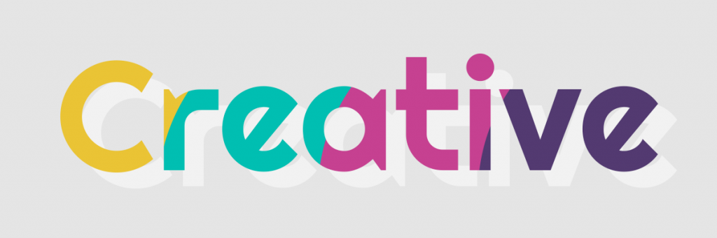 This interesting font stands out with it’s atypical slanted “e”, and its bright, modern colours invite its viewers to look inside its shapes.
3. Caring
 The visualisation of our internal functions and desires can be linked to warm colours, like pink. We’ve paired that up with a clean, graceful looking font, to represent the word “caring”.
4. Playful
 The yellow colour is used here to provoke a happy, infantile feeling, with its outlined fonts and sporadic arrangement.
5. Professional
 Blue is the colour associated with trust, loyalty, wisdom, confidence, and intelligence – all of which fall under the roof of professionalism. We’ve matched this colour with a clean, sans serif font.
6. Modern
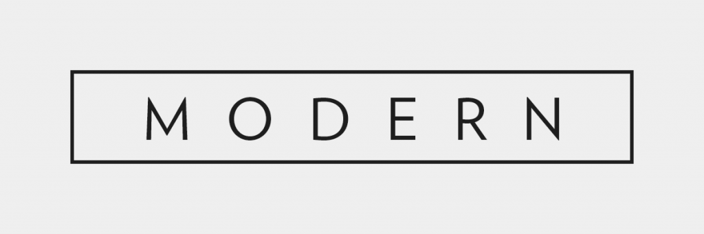 Modernism and minimalism often go hand in hand, with a strong emphasis on simplicity. This idea is conjured here, with the stark contrasting black and white, paired with a use of empty space.
7. Nurturing
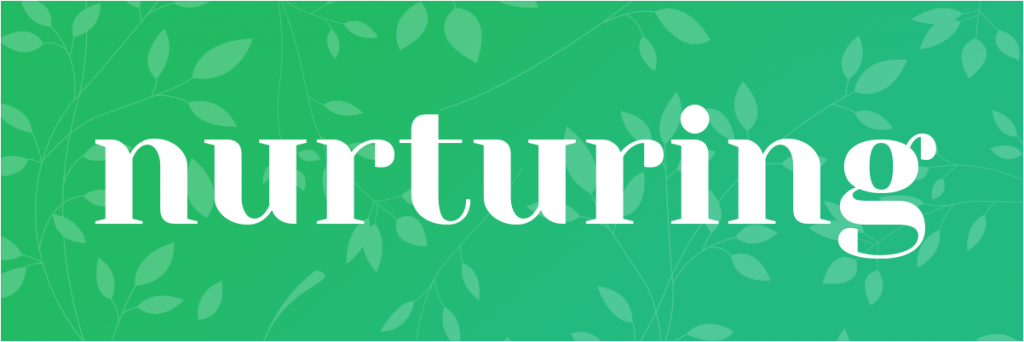 The colour green can symbolise growth, harmony and renewal. The style here gives off a calm, reassuring feeling, with a nature themed background, and a stylistic font.
8. Proud
 This bold, capitalised typeface juxtaposed with a calm, positive yellow background is used to give a sense of pride and honour.
9. Elegant
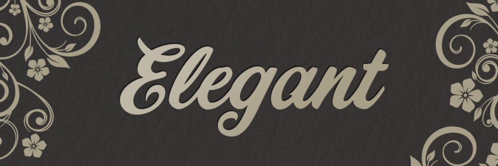 Darker colours such as black or grey are often used for formality and prestige. We’ve chosen a cursive, artistic font with a distinguishing background to represent luxury and elegance.
There are over 24,000 schools in the UK alone. Stand out from the crowd; consider what you want to tell your audience, and how you want to be perceived.
If your website is nicely presented, it lends you the credibility of a well established, successful school. First impressions count, and identity can be just as important as that Ofsted award. It doesn’t take a lot to consider who you are, but the impact of a few simple choices can offer a wealth of value.
Here at Greenhouse we pride ourselves on meticulously crafted websites. If you’d like to discuss how a new website can help your school, please get in touch.